Freelance project focused on creating the visual and functional foundation for a clinic management system.
I was responsible for the visual identity, mockups, design system, documentation, and handoff.
A tech company approached me to create the visual identity and mockups for a scheduling flow for the MVP of their new SaaS.
The idea of building a Design System for this project arose when the client expressed their intention to continue expanding the system with additional modules in the future.
To make my work easier, I decided to create a reusable and flexible foundation that would help me maintain consistency as the system grew.
1.
Visual Identity
I started by creating a lean visual identity, initially establishing the color palette and typography.

2.
Tokens and Variables
With the color palette and typography defined, the next step was to create the variable foundation in Figma.
To organize the tokens, I used a three-level structure: brand, alias, and role.
Brand

At the brand level, I stored the raw values for color, typography, and scale.
Alias

At the alias level, names are assigned to the raw values for easy reference.
Roles

At the role level, the references are assigned a specific function.
The variables were also essential to address a key aspect of the project: the system needed to support two different views.
On one side are the professionals, who use the management system internally.
On the other are the patients, who access a public portal within each clinic’s mini-site to schedule and track appointments.
This configuration required design flexibility, as each clinic has its own visual identity that needed to be reflected across the interfaces.
Color Token Structure

The image above explains the color token structure.
The neutral colors, labeled general, are shared across all user types and applied to elements such as backgrounds, borders, and text.
The system tokens are used exclusively for the internal system view, while the user tokens store each clinic's specific colors.
On the backend, these user tokens are always linked to the brand's custom color, ensuring that components adapt to each client's visual identity without losing consistency.

Role tokens follow this logic: surface indicates the interface element where the color will be applied, system defines the user type (clinic or patient), and secondary-action represents the specific state or function of that element.
3.
Components
To build the components, I followed Brad Frost’s Atomic Design methodology.

I chose this methodology to organize components into different levels of complexity, facilitating maintenance and reuse in new flows.
Here, I show how small atoms evolve into complete organisms, such as the time-slot selection card.
4.
Handoff and Documentation
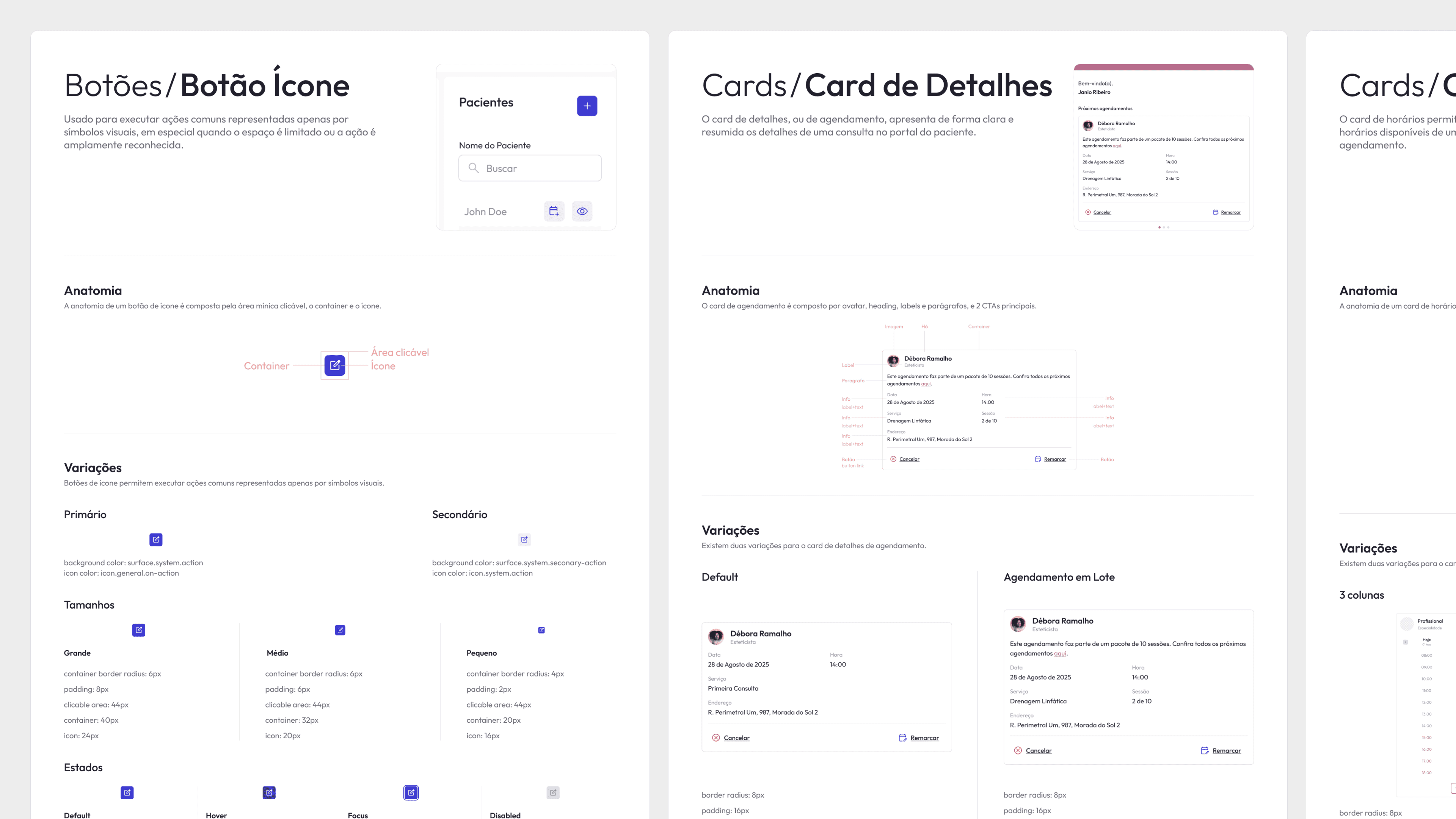
All documentation was centralized in Figma, featuring detailed component specifications, variations, states, and usage examples.
Accessibility Annotations
To ensure accessibility best practices, I used the Web Accessibility Annotation Kit to record the properties of each component, such as buttons, links, and images, indicating accessible attributes and specific behaviors.


5.
Design
Finally, the mockups show the application of the Design System in both the professional user flow and the patient experience.

